In AutoCAD's output SHX fonts are always treated as graphics and at times even True Type fonts are treated as graphics. When you zoom in on the text in the PDF some of the characters may appear jagged. Quite often though when you print the PDF to a printer or plotter the text looks fine.
True Type Fonts
If your True Type Fonts are coming out jagged it's most likely because you have used a width factor for the True Type Font when you defined the text style in AutoCAD. Click Here to Learn About Using True Type Text in AutoCAD
SHX Fonts
It's common when zoomed in at 2000% in a PDF for the shx(vector) fonts to look like this.
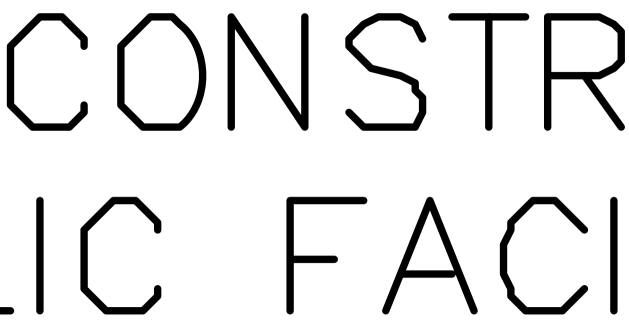
There's several reasons for this and it is NOT a bug in the software, it's basically the rules of geometry.
1.) Vector fonts are simply a series of vectors (lines) in AutoCAD. When you create a PDF at say 300 dpi the endpoints of every vector must start and end on a pixel location based on that 300 dpi. So 1/300 gives you a pixel every 0.0033 inches. Now the above text is actually 0.03"x0.06" per letter in the PDF. That means that we have 9 pixels wide by 18 pixels tall to draw the lines of the letter into. That's not much room at all when you think about it.
2.) When AutoCAD is calculating the endpoints for each line of the letter it must round up or down to the nearest pixel. It does not know which direction may make it look better or worse, it just uses pure mathematics to determine the closest one and that is what it outputs to us.
3.) You may say that you don't see this problem when you output to Adobe's PDF driver or to some other PDF driver. The reason for that is that their driver is probably outputting at 600 or 1200 dpi. Fine for some drawings and better for text like this but try getting AutoCAD to output a large format engineering drawing with Aerial images at 1200 dpi. The 300 to 400 dpi range is what we have found works best overall. And remember, the text often looks perfectly fine printed out to paper, just not when zoomed in 2000% or higher in the PDF viewer.
4.) True Type fonts on the other hand only need to have their start point for the line of text to fall on a specific pixel. Beyond that the font information is either stored on the users system or in the PDF itself and the viewing or printing application can render it at the DPI that the device can handle. So on screen it will render cleaner when you are zoomed in 2000% and when you print if the printer is a 300 dpi printer it will be the same. But if the printer is a 600 dpi printer then it can render it at 600 dpi instead of the 300 saved in the PDF. But there are other inherit problems with using True Type Fonts in AutoCAD so please see the following page before deciding to switch everything over to True Type Fonts - Click Here to Learn About Using True Type Text in AutoCAD
5.) If you do want to raise the DPI to a higher value for the vector artwork but would like to keep the images at a lower DPI to make a smaller file we can do that by downsampling the images that AutoCAD sends us. We unfortunately do not have this as a standard setting but it's as a global setting in AcroPlot. Use the Setup->Options menus and then on the PDF Tab you can set the downsample and DPI value for the basic types of images. As a general approximation going down by 50% makes the images 200% smaller in file size because everything is a factor of 4. If you are printing directly to the PDF-XChange for AcroPlot Pro driver then you will find these settings under the Graphics Tab of the drivers Printing Preferences. This does cause longer processing times because AutoCAD actually sends us the image at the DPI you specify in the main settings but then we downsample it to what you want it to be.
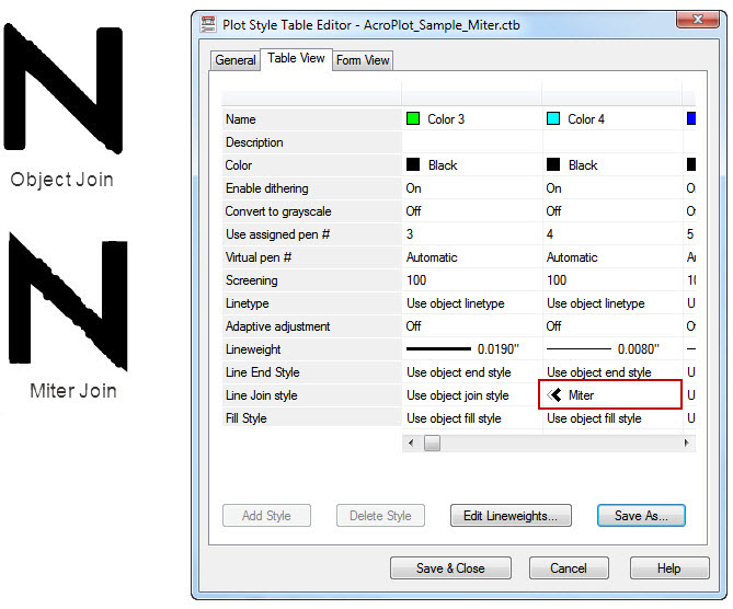
6.) Another thing that can cause jagged looking text is if you set the Line Join in your ctb file to Miter. The miter join style will extend the outside of the lines until they meet. So this will cause peaks on letters like M and N and not on letters like T. Because of this we suggest you use the object join style or the